The stakeholder asks what the project means for their surroundings. The answer is somewhere in a two-hundred-page EIA report.
Somewhere.

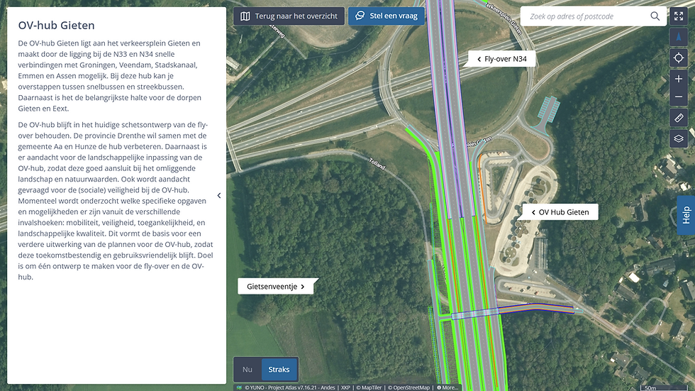
Impact Map
Showing the physical impact of a project on its surroundings per theme and location.
The report still exists — but the conversation no longer has to start there.
The Impact Map places the results of environmental research on the map — per theme, per location. Whoever looks up their own surroundings switches between noise, vibrations, and particulate matter without losing their place. Colours translate values directly: green better than now, yellow neutral, orange slightly worse, red worse. Those who want to know more click through to the measurement, the methodology, and the evidence.
Accessibility
Technical report translated into a human-readable map.
Overview
All themes in one place for one location, not spread across reports.
Evidence
Substantiation one click away, no longer a search.
Works with
Plan Map
Showing the spatial impact of a plan on its surroundings.
Communication


Q&A Map
Answering stakeholder questions at the location they relate to.
Communication

Visualisation Map
Communicating the visual integration and elaboration of a design.
Communication